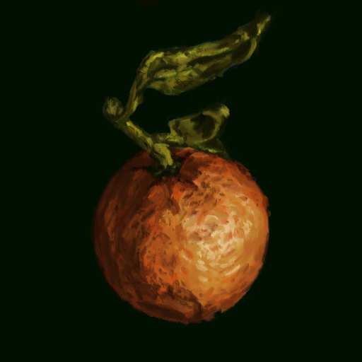
Cottage Core has been growing in popularity since the past few years. Its roots in nature are perhaps what drives people to it. This is evident through the ample flowers, mushrooms, leaves, earthen colours, and the drive to DIY that the community fosters.
As I assembled a tote bag for my cottage core audience last week, I realised this tribe’s inclination towards products that are creative and have a personal touch – be it hand knitted tote bags and scarves, scrapbooks, handwritten letters, and scrunchies sourced from leftover cloth. They heavily rely on imagery that is natural, living, and fresh.
I chose a cottage core winter scarf, as I identified it as a common product that has scope for creative differentiation, to conduct my competitive analysis. As noted above, creativity is valued by the cottage core audience. Therefore, creativity along with cost became the two factors I used to plot for my competitive analysis.
At the intersection of expensive and cheap and towards the edge of creativity lies the blue and white scarf that I had chosen for my tote bag. About the other items, a novel fox shaped hand knitted scarf is expensive and is priced at £250. A commonly seen scarf in earthy colours is the cheapest and least creative of the lot. A hand knitted granny square scarf, which is popular among crocheters, is priced at a whopping £320. My favourite was the lightly knitted floral scarf in blue, which looks refreshing and is also priced moderately.
I could conclude from the competitors’ analysis that from the range of creative options across price ranges, most products fell in the Expensive-Creative quadrant. This might not be a true reflection of the cottage core community, as these were consumer facing products while the tribe themselves believe in making products themselves. But since the final leg of the workshop requires the branding of a customer facing product – a toilet cleaner, it becomes important to incorporate this finding and making it look and feel like personalised luxury.
I chose ‘swoosh & done’ as the name of the toilet cleaner as it is onomatopoeic, colloquial, and easy to understand, without being gross. The typeface, Quimby, feels handwritten and therefore, personalised. The copy beneath taps on the growing need for provenance and cottage core’s self-reliance by saying ‘With the fragrance of real Alpine flowers, DIY your toilet cleaning!’. The hero of the design, however, is the image of pressed flowers, which is popular amongst cottage core enthusiasts. In the context of this toilet cleaner, it signifies fragrance and freshness. The bottles themselves complement the colour palette of the hero image and the bottles with their leafy-green background scream cottage core.
